Insight
QA Touch Insights
QA Touch Insights gives you a dashboard view of your project’s testing health coverage, automation, defects, productivity, and release readiness all in one place.
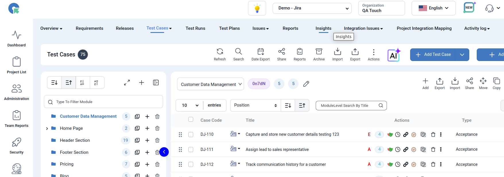
How to Access Insights
- Log in to your QA Touch account.
- Open the desired Project.
- Click on the Insights menu.
1. Project Health
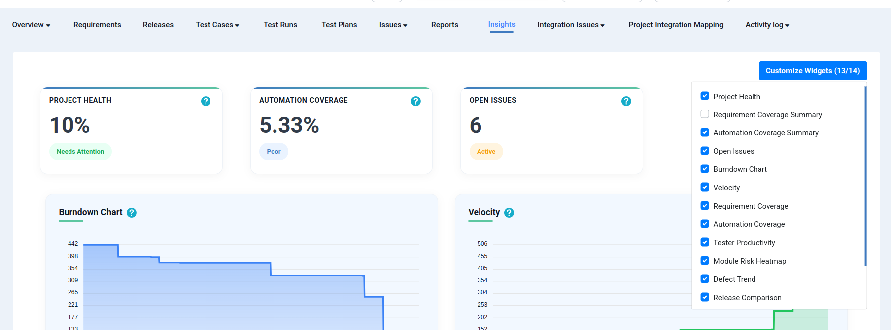
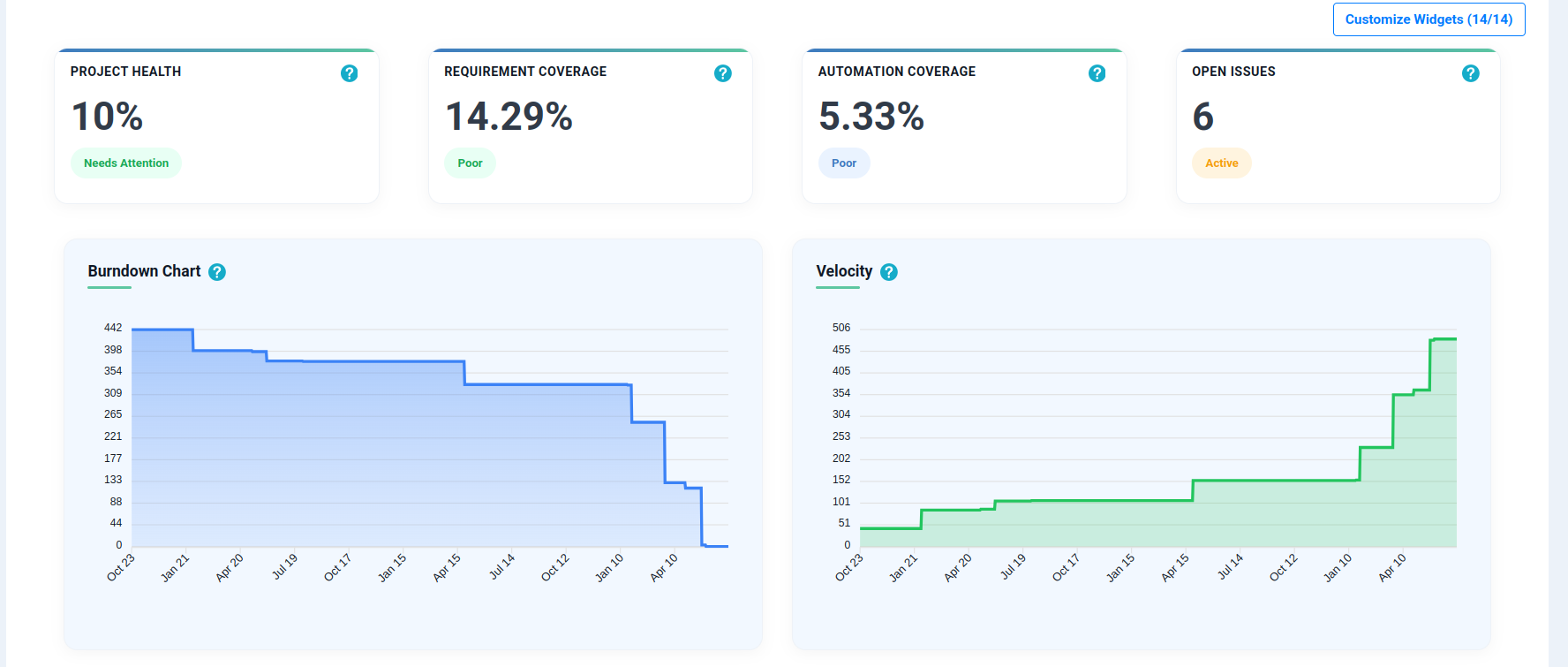
What it shows: Overall project quality score based on key testing and quality metrics.
Steps to use:
- Go to the Insights dashboard.
- Locate the Project Health widget (usually at the top).
- Check the score — higher scores indicate better overall test coverage, execution, and issue resolution.
- Click the widget to drill down into the metrics contributing to the score.
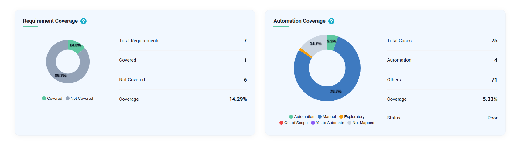
2. Requirement Coverage (Summary)
What it shows: Percentage of requirements mapped and covered with test cases.
Steps to use:
- Open the Requirement Coverage widget.
- View the percentage of requirements that have linked test cases.
- Identify requirements with low/no coverage.
- Click through to see the list of uncovered requirements and add test cases as needed.
3. Automation Coverage (Summary)
What it shows: Percentage of test cases automated across the project.
Steps to use:
- Open the Automation Coverage widget.
- Review the automated vs. manual test case split.
- Use this to plan which modules need more automation.
4. Open Issues
What it shows: Total number of unresolved issues currently open in the project.
Steps to use:
- Check the Open Issues counter on the dashboard.
- Click on it to view the full list of open/unresolved issues.
- Filter by module, severity, or assignee to prioritize fixes.
5. Burndown Chart
What it shows: Tracks remaining test executions over time to measure testing progress.
Steps to use:
- Open the Burndown Chart widget.
- Select the date range or sprint/cycle you want to track.
- Review the downward trend line — a steady decline indicates on-track progress.
- Identify flat/stalled periods to investigate execution delays.
6. Velocity
What it shows: Shows the number of test executions completed over time.
Steps to use:
- Open the Velocity widget.
- Choose the time period (daily/weekly/sprint).
- Compare execution counts across periods to gauge team throughput.
- Use this data for future sprint/cycle planning.
7. Requirement Coverage (Detailed View)
What it shows: Visualizes covered vs. uncovered requirements and overall coverage.
Steps to use:
- Open the detailed Requirement Coverage chart.
- Review the visual breakdown of covered vs. uncovered requirements.
- Click on any segment to view the specific requirements in that category.
- Assign test cases to uncovered requirements directly if supported.
8. Automation Coverage (Detailed View)
What it shows: Breaks down automated, manual, exploratory, out-of-scope, and unmapped test cases.
Steps to use:
- Open the detailed Automation Coverage chart.
- Review each category: Automated, Manual, Exploratory, Out-of-scope, Unmapped.
- Focus on the “Unmapped” or “Out-of-scope” segments to plan next steps.
- Use insights to build an automation roadmap.
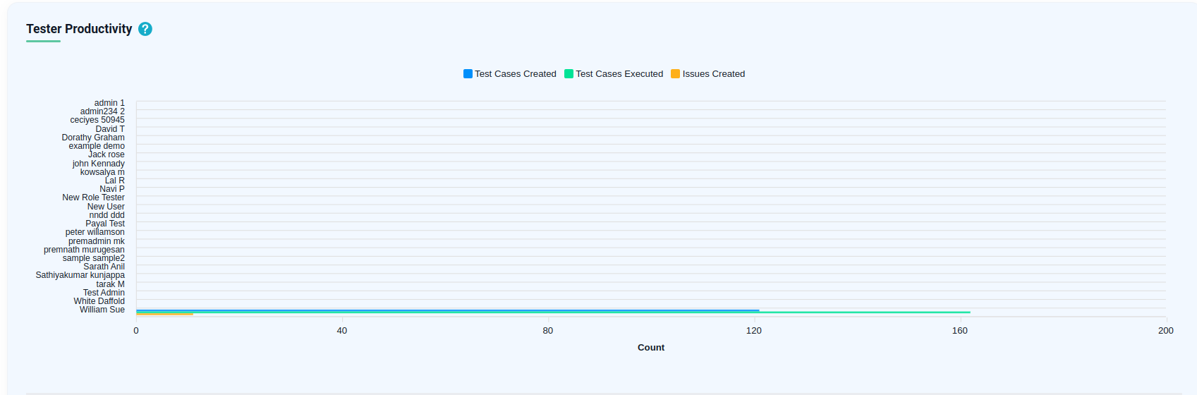
9. Tester Productivity
What it shows: Compares test case creation, execution, and defect reporting across testers.
Steps to use:
- Open the Tester Productivity widget.
- Select the tester(s) or time period to compare.
- Review metrics: test cases created, executed, and defects reported.
- Use this for workload balancing and performance reviews.
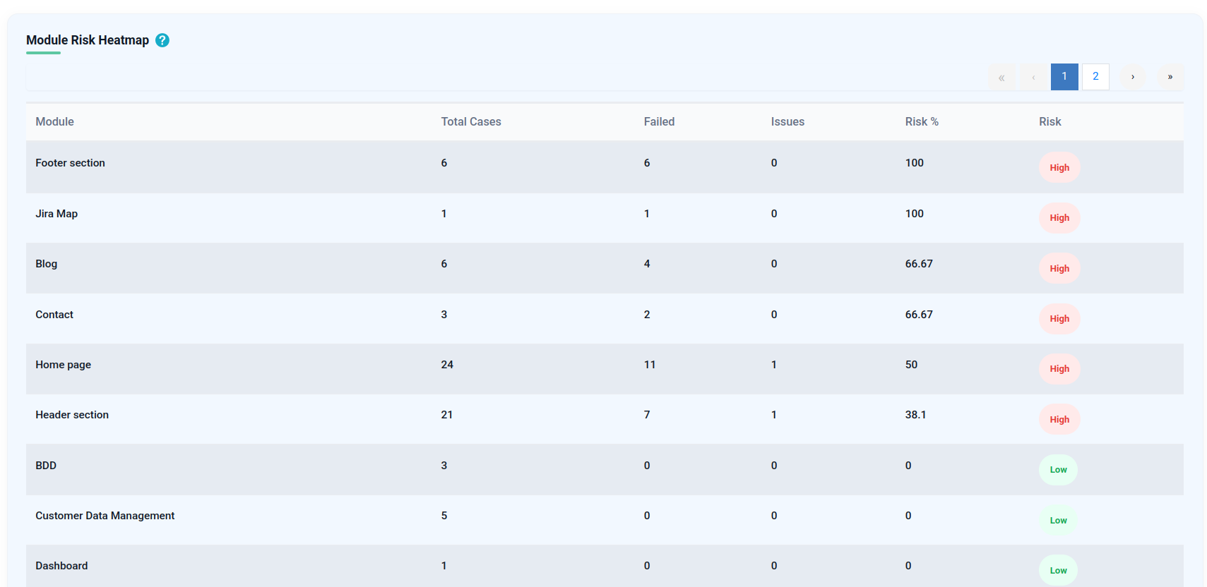
10. Module Risk Heatmap
What it shows: Highlights high-risk modules based on failures, issues, and test results.
Steps to use:
- Open the Module Risk Heatmap.
- Look for modules highlighted in red/orange (high risk).
- Click on a module to see failure counts, open issues, and test results.
- Prioritize testing/fixes for high-risk modules first.
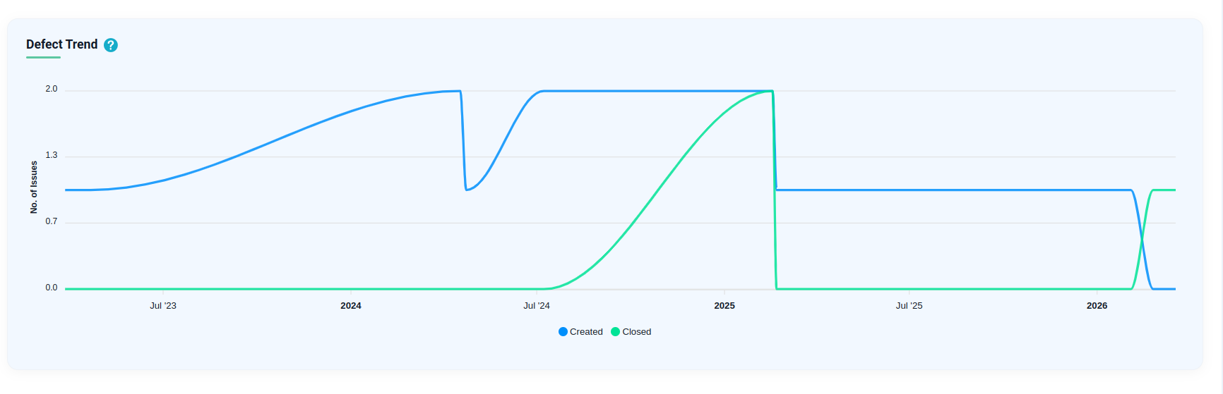
11. Defect Trend
What it shows: Tracks defects created and resolved over time to monitor quality trends.
Steps to use:
- Open the Defect Trend chart.
- Select the date range to analyze.
- Compare the “created” vs. “resolved” lines — a shrinking gap indicates improving quality.
- Spot spikes in defect creation to investigate root causes.
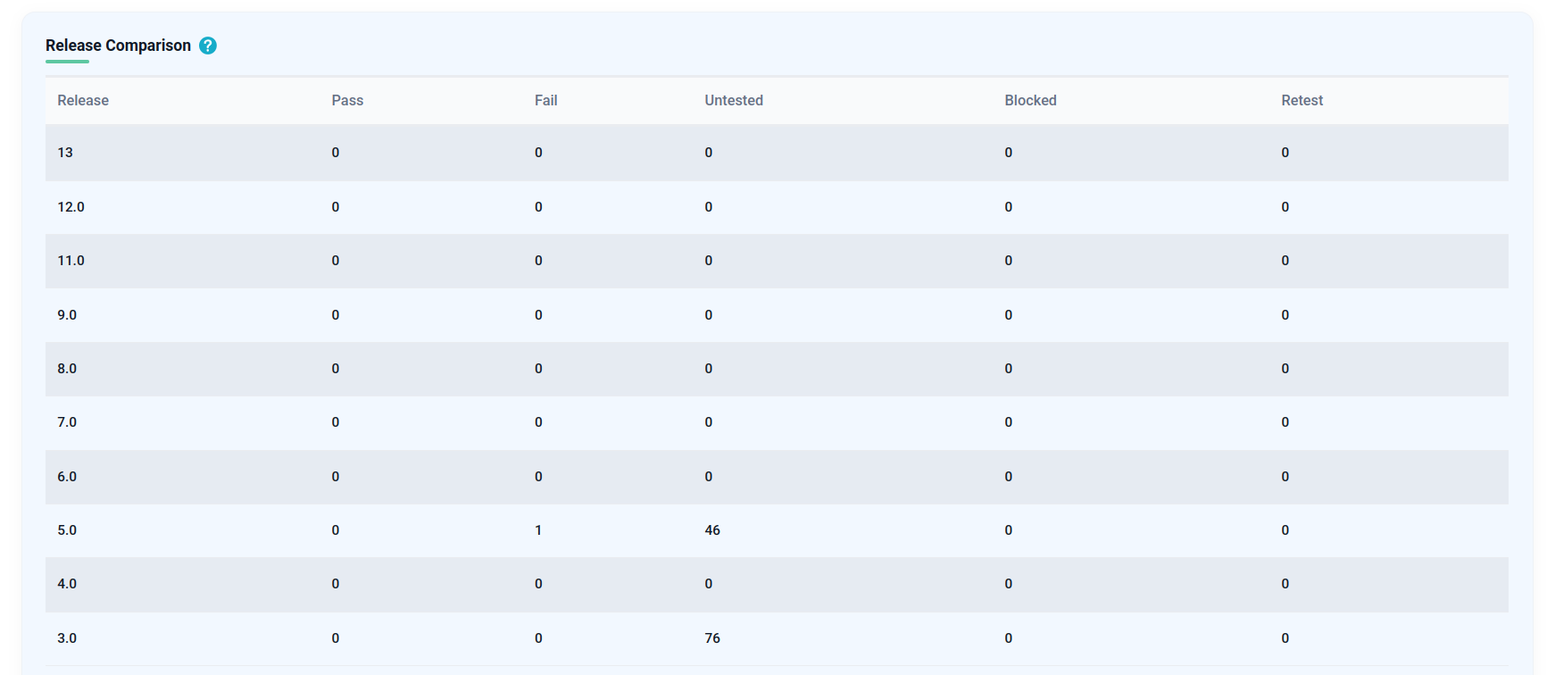
12. Release Comparison
What it shows: Compares testing outcomes across releases, including pass, fail, blocked, and untested cases.
Steps to use:
- Open the Release Comparison widget.
- Select two or more releases to compare.
- Review the pass/fail/blocked/untested breakdown for each release.
- Use this to assess release readiness and quality trends over time.
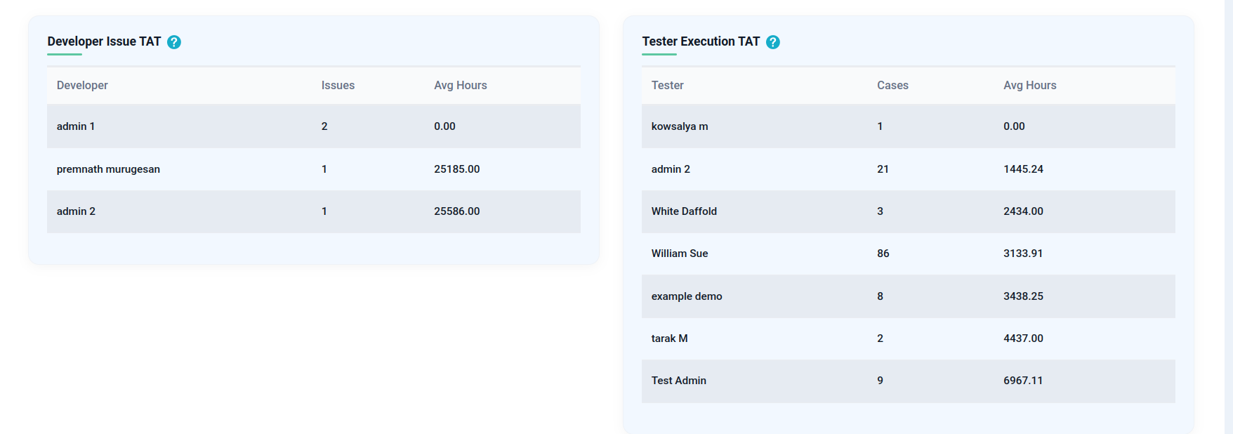
13. Developer Issue TAT (Turnaround Time)
What it shows: Measures the average time developers take to resolve assigned issues.
Steps to use:
- Open the Developer Issue TAT widget.
- Review the average resolution time per developer or team.
- Identify bottlenecks where TAT is high.
- Use this for sprint planning and workload distribution.
14. Tester Execution TAT (Turnaround Time)
What it shows: Measures the average time testers take to execute assigned test cases.
Steps to use:
- Open the Tester Execution TAT widget.
- Review average execution time per tester.
- Identify testers/modules with delays.
- Use this to improve test planning and resource allocation.